The biggest myth about an OnlyFans profile picture is that it’s “just a hot photo”.
It’s not. It’s a tiny, brutally competitive decision point—and it’s doing three jobs at once:
- Stop the scroll (attention)
- Signal the right promise (positioning)
- Pre-qualify the right fans (conversion + retention)
If you’re an Aussie-based creator like calerpa*—US background, digital marketing brain, building an acting career, and trying to define your own version of “pretty enough” without spiralling—your profile pic is also doing a fourth job: protecting future-you. Because the photo you choose today quietly shapes what people expect from you six months from now.
I’m MaTitie (editor at Top10Fans). Let’s myth-bust the common assumptions, then I’ll give you a practical, no-fluff system for picking a profile pic that earns clicks and keeps you in control.
Myth 1: “The more revealing the profile pic, the more subs”
Reality: revealing can work, but clarity works better.
A profile photo is not the place to show your entire range. It’s the place to communicate one clean message: “You’ll enjoy what you find here.” When creators default to “maximum skin”, they often accidentally create three problems:
- You blend in (lots of creators do the same thing)
- You attract mismatched buyers (people chasing a specific explicit expectation)
- You box yourself in (future content feels “behind” your PFP, not ahead)
Look at how mainstream social feeds reward a consistent “signal”. For example, coverage around Sophie Rain’s bikini posts (and the way fans respond to them) shows how a single strong visual theme can drive engagement when it’s recognisable and repeatable. The takeaway isn’t “wear a bikini”; it’s: make the promise obvious at a glance.
Better mental model: your PFP is a movie poster, not the full movie.
Myth 2: “If it’s a great selfie on Instagram, it’ll work on OnlyFans”
Reality: OnlyFans crops hard, compresses, and displays your image tiny.
On mobile, your profile picture often appears as a small circle. That means:
- intricate outfits disappear
- busy backgrounds become visual noise
- full-body shots lose face recognition
- “cool lighting” becomes “muddy blur”
Also, OnlyFans visitors behave differently from Instagram scrollers. IG can tolerate ambiguity because your reel will autoplay and your grid gives context. OnlyFans often gives you one glance before a click decision.
Better mental model: build for “thumbnail reality”, not camera reality.
Myth 3: “I need to look like everyone else to be safe”
Reality: sameness is the risky choice.
Here’s the candid bit: if you’re already feeling pressure to be feminine “enough”, copying the most common creator look can soothe anxiety short-term… but it usually hurts long-term. Why?
- You don’t stand out in discovery and link previews
- Fans can’t easily remember you
- You compete on the one axis that is easiest to replace: “generic hot”
A better path is self-defined beauty with a consistent brand cue—a colour, vibe, hairstyle, framing choice, expression—something you can own without constantly “performing” femininity for strangers.
What the news is quietly teaching creators about profile pics
A few current stories highlight why your profile image isn’t just aesthetics—it’s reputation, recognisability, and revenue resilience.
1) The “headline effect”: your face becomes the story
When Perthnow covered Aussie OnlyFans model Gemma Doyle being “torched online” after a Bali incident, the bigger creator lesson is this: once you’re a known name, your image travels farther than your posts. People screenshot, repost, and form opinions fast.
I’m not here to judge anyone’s drama. I’m here to protect your business: choose a profile picture you’d be okay seeing out of context—because that’s how the internet will use it.
PFP rule: avoid anything that can be easily reframed as “look at this mess” if a random page reposts it with a nasty caption.
2) The lookalike problem: if you’re “generic pretty”, you’re forgettable
Mandatory ran a piece on Lexi Marvel explaining why people mix her up with Sophie Rain. Again, zero judgement—this happens across creator industries. But it’s a flashing neon sign for branding:
If your PFP says only “conventionally attractive girl in flattering lighting,” you raise the odds of:
- being confused with someone else
- fans searching the wrong name
- people assuming you’re a repost account
- leaking traffic to a bigger creator who shares your vibe
PFP rule: add one distinctive, repeatable visual anchor (more on that below).
3) The money lesson: your profile pic is part of revenue risk management
Usmagazine covered Annie Knight saying exchange rates are cutting her monthly income. You can’t control currency markets, but you can control conversion efficiency. When outside factors squeeze revenue, the creators who stay stable usually have:
- a strong funnel (profile views → subs)
- clear positioning (fans know what they’re paying for)
- recognisable branding (trust + memory)
Your profile picture is at the top of that funnel. Treat it like a financial lever, not a beauty contest.
The OnlyFans profile pic “job description” (use this checklist)
A high-performing OnlyFans profile picture should score well on six criteria:
- Recognisable at 40px
- Matches your page promise (sweet, spicy, girlfriend-y, cosplay, fitness, artsy, etc.)
- Builds trust (real person, clear eyes/face, not catfishing vibes)
- Creates curiosity (a hint of story)
- Feels sustainable (you can keep showing up like this)
- Avoids future regret (acting aspirations = think long-term)
If your current PFP fails #1 or #3, fix that first. It’s like having a shopfront sign nobody can read.
The 5 best OnlyFans profile picture styles (and who they suit)
You don’t need more random tips—you need a few reliable “formats” you can choose from.
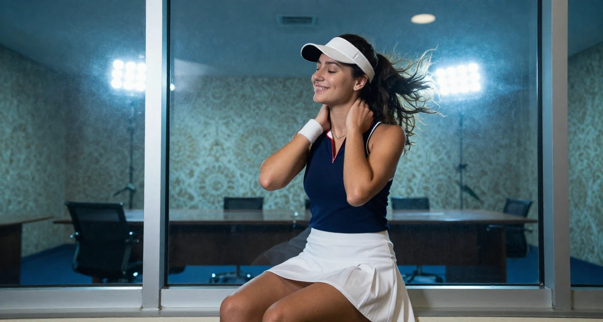
Style A: The clean close-up (best for conversion)
What it is: shoulders-up, face forward, soft confident expression, simple background.
Why it works: maximum clarity in tiny circles; strong trust signal.
Make it yours: pick a signature element—e.g., a specific lipstick tone, a hair accessory, a colour backdrop.
Style B: The “character poster” (best for acting energy)
Since you’re building an acting-adjacent brand, this one’s powerful.
What it is: close-up plus one prop/costume cue that suggests a role (without becoming Halloween).
Why it works: creates story and memorability.
Examples of cues: vintage phone, leather jacket, satin robe edge, script pages, microphone, eyeliner wing, a single bold colour gel.
Style C: The playful wink (best for humorous, candid creators)
What it is: candid grin, cheeky eyebrow, slightly off-centre framing.
Why it works: attracts fans who want your personality, not just a body.
Warning: don’t go too “goofy” if your page is premium-luxe; match the promise.
Style D: The tasteful tease (best for spicy pages without boxing yourself in)
What it is: implied sensuality—neckline, collarbone, lingerie strap—without full explicit framing.
Why it works: signals spice while leaving you room to escalate in content.
Key: lighting and crop matter more than skin amount.
Style E: The high-contrast silhouette (best for niche aesthetics)
What it is: strong side light, shadow, graphic shapes.
Why it works: stands out in a sea of beige selfies.
Risk: can reduce trust if your face isn’t visible; consider pairing with a clear banner and verified socials.
The “Bonija Blū” confidence trap (and how to use it without spiralling)
In entertainment coverage (including Reklāma’s mention of OnlyFans model Bonija Blū), there’s a recurring storyline: friends encouraging someone to return to modelling because “she’s never looked better” and the platform is a “no-brainer”, inspired by how others (like Kerry Katona) have earned and grown in confidence.
That narrative can be motivating—but it can also quietly teach a dodgy rule: confidence comes after you look a certain way.
For creators who already feel pressure to be feminine “enough”, the healthier business mindset is:
- Confidence comes after consistency (posting, testing, improving)
- Attractiveness is a tool, not the entry fee
- Your best look is the one you can repeat without stress
So yes: pick a flattering photo. But pick one that doesn’t require a three-hour ritual you’ll resent in two weeks.
A practical system: choose your PFP in 30 minutes
Do this like a marketer (because you are one).
Step 1: Decide your “promise in one line”
Write one sentence fans would say after subscribing. Examples:
- “She’s playful, flirty, and chats like a real person.”
- “High-quality spicy pics with a glam vibe.”
- “Cosplay girlfriend energy with consistent drops.”
If you can’t write this line, your PFP can’t do its job yet.
Step 2: Pick one brand anchor (only one)
Choose one recognisable cue:
- Colour: hot pink / red / black / teal
- Accessory: hoop earrings / choker / glasses
- Lighting: warm sunset / neon / clean studio white
- Expression: smirk / soft smile / bold stare
One anchor beats five random “aesthetic” choices.
Step 3: Use the “3-second test”
Open your OnlyFans profile preview (or any circular crop app) and show it to a mate for 3 seconds. Ask:
- What vibe do you get?
- Is she friendly, premium, cheeky, intense?
- Would you click?
If they hesitate, the image is doing too much (or not enough).
Step 4: Run the “mistaken identity test”
Ask: “Could this be anyone?”
If yes, add a stronger anchor or re-shoot with a clearer face and simpler background. The Lexi/Sophie lookalike coverage is your reminder: the internet will lump you into the nearest familiar category unless you give it something distinct.
Step 5: Future-you check (acting-friendly)
Ask: “If this photo is screenshotted and floating around in 2 years, do I feel okay?”
If not, keep the vibe but adjust the explicitness.
The top PFP mistakes (and quick fixes)
Mistake 1: Full-body shot
Fix: crop to face + upper torso. Save full-body for your header/banner or feed teasers.
Mistake 2: Sunglasses, phone covering face, heavy filters
Fix: show eyes, reduce smoothing, keep skin texture. Trust converts.
Mistake 3: Cluttered background (bathroom, messy room, random people)
Fix: plain wall, curtain, or blurred background. You’re the product and the brand.
Mistake 4: “Trying to be sexy” face
You know the one. The strained pout that reads like effort. Fix: aim for confident comfort. A relaxed smirk beats forced seduction.
Mistake 5: Mismatch with your current offer
If your page is mostly teasing, but your PFP is full explicit energy, you’ll get more refunds, chargebacks, and angry DMs. Fix: align the promise. Under-promise, over-deliver.
Mistake 6: Changing it every week
Fix: treat your PFP like a logo. Keep it stable for at least 30 days unless it’s clearly hurting conversion.
What to do if you’re torn between “sweet” and “spicy”
Because you’re balancing early fanbase monetisation and long-term brand compatibility (including dating-life considerations), you don’t need to pick a single identity forever. You need a stable front door.
Here’s a clean approach:
- PFP: “public-safe spicy” (tasteful tease or clean close-up)
- Banner/header: clearer hint of your niche (glam, cosplay, girl-next-door, etc.)
- Pinned post: your real promise + boundaries + posting rhythm
- Feed/PPV: where you escalate (if you choose to)
This lets you explore without having your face be the loudest possible claim.
Quick photo direction you can use today (no fancy gear)
You can shoot a high-performing PFP with a phone.
Lighting:
- Stand facing a window (open shade).
- Turn off overhead lights (they cast under-eye shadows).
Camera:
- Back camera if possible (sharper).
- Slightly above eye line (subtle lift, not “MySpace angle”).
Framing:
- Face fills 60–70% of frame.
- Leave a little space above head for circular crop.
Expression prompts (to avoid “trying”):
- “I’m about to laugh.”
- “I know something you don’t.”
- “I’m listening.” (softens the eyes instantly)
Edit:
- Minimal. Slight exposure up, contrast down a touch, sharpen lightly.
- Avoid extreme warm/orange filters (they can look cheap in thumbnails).
A/B testing without losing your mind
If you’re analytical (Seattle marketing grad energy), you’ll want to test. Do it, but don’t turn it into a self-worth scoreboard.
Simple test plan (14 days):
- Week 1: PFP A (clean close-up)
- Week 2: PFP B (character poster or tasteful tease)
Track only:
- Profile visits → subscriber conversion (if you can)
- DM volume quality (are they aligned?)
- Refund/complaint vibes (lower is better)
If results are similar, choose the one that feels more sustainable and future-friendly.
Safety, boundaries, and low-risk choices (because risk awareness can be… optimistic)
I’m not here to scare you—just to keep you in control.
Low-regret PFP choices:
- No visible street signs, apartment views, work lanyards
- No third parties in frame (even blurred)
- Avoid unique location identifiers (gym logos, local cafe signage)
- Keep metadata private (most platforms strip it, but don’t rely on that)
Also: if you’re dealing with “I must be feminine enough,” remember boundaries are attractive to the right fans. A confident, clear PFP can be soft without being available to everyone.
The “creator brand ladder”: where your PFP fits
Think of your brand in layers:
- PFP: recognisable you
- Name + bio: what you do and for whom
- Banner: your niche flavour
- Pinned post: what to expect + posting rhythm + boundaries
- Feed: proof
- Messages: relationship + retention
If layer 1 is confusing, every other layer has to work harder (and you’ll feel like you’re constantly “performing” to compensate).
My recommended PFP for you (based on your context)
If I were advising calerpa* directly, I’d steer you to one of these two:
- Clean close-up with a mischievous smirk (humorous, candid, high trust)
- Character poster-lite (actor-forward, memorable, future-proof)
Keep it flirty but not maximal. Let your content do the heavy lifting. That’s how you grow sustainably and keep your options open—career-wise and personally.
If you want help stress-testing your positioning (without you having to reinvent the wheel), you can also join the Top10Fans global marketing network. It’s built for creators who want global traffic without losing their voice.
📚 More reading for Aussie creators
If you want extra context, these recent stories are useful for thinking about reputation, recognisability, and income stability.
🔸 Gemma Doyle torched online after Bali bikini theft claim
🗞️ From: Perthnow – 📅 18 Feb 2026
🔗 Read the full story
🔸 Lexi Marvel explains Sophie Rain lookalike mix-up
🗞️ From: Mandatory – 📅 17 Feb 2026
🔗 Read the full story
🔸 Annie Knight says FX rates are cutting her monthly income
🗞️ From: Usmagazine – 📅 17 Feb 2026
🔗 Read the full story
📌 A quick heads-up
This post blends publicly available info with a light touch of AI help.
It’s here for sharing and a bit of discussion — not every detail is officially verified.
If something looks off, message me and I’ll sort it.
💬 Featured Comments
The comments below have been edited and polished by AI for reference and discussion only.